iOS vs Android
What’s the difference when designing apps for iOS or Android?
We will discuss the design of the most important principles you should keep in mind when designing apps for both Android and iOS.
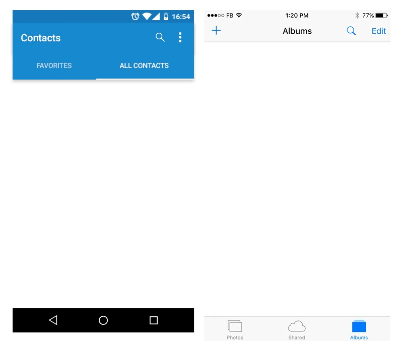
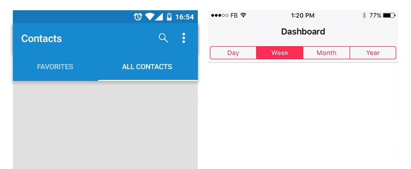
Status bar
The status bar is a global element on all operating systems, it is the bar that appears at the top on almost every app. It has a standard size and icons so you don’t need to design a custom one.
On Android and iOS, the status bar indicates different elements like the battery charge, network connection, and clock.The main difference here is that Android can also show icons for running apps. Places of elements also differ.
_1546534936208.png)
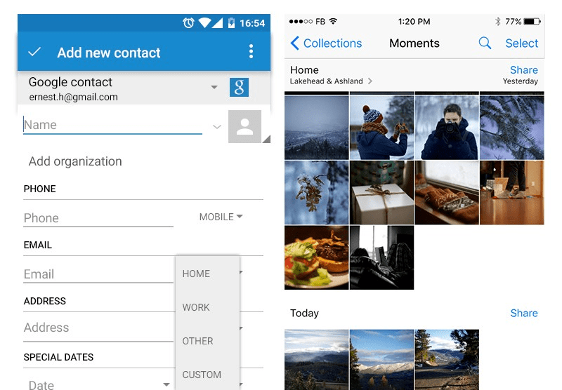
Navigation bar
Both operating systems have a navigation bar directly below the status bar. It has a standard height. The navigation bar contains navigation controls like filtering, menu, search and “back” button only on iOS.
Also, this area is used to display the title of the app or a specific app screen, e.g. “Facebook”, “Edit Profile”, “Settings” etc. The main difference between the two OSs is that on iOS that title is centered and on Android, it is placed on the left.
_1546535011847.png)
Back button
It’s important to note that Android devices have a physical back button used to go back to the previous screen. In comparison, iPhone doesn’t have this button and it must be included in the navigation bar.
_1546535053675.png)
Tab bar
This bar mostly appears in different places on the screen depending on the operating system. For iOS, it is placed at the bottom of the screen and has multiple tabs with icons and text below, although this depends on the app.
Whereas Android places the tab bar below the navigation bar, so it has three bars stacked on top of each other — the top status bar, then the navigation bar, and the tab bar. Android has a global navigation component with three buttons that is placed at the bottom of the screen, with buttons to go back, home and to show history. This menu is shown on every screen across an app.
Cards, or not?
Cards are becoming the primary UI pattern in digital design. They allow users to consume quick bites of content in a way that suits mobile behaviors. Cards fit with Android’s material design. Using drop shadows and reasonable gutters between cards will create a native look and feel natural.
On iOS, the basic view is usually flatter. Even big apps like Facebook and Instagram use cards that can’t be out of tune with iOS guidelines. If you’re going with cards on iOS be very gentle with any use of shadow, and try to keep them as subtle as possible.
_1546535273941.png)
Typography
Default system fonts are San Francisco on iOS and Roboto on Android. It’s essential to choose readable fonts and as a general rule don’t use more than two fonts in your interface, no matter the operating system. On both OSs, typography should be readable, scannable and has suitable whitespaces.
_1546535316180.png)
Buttons
Buttons share a similar structure on both Android and iOS. The main difference is that Android has noticeable shadows that create a feeling of depth, where on iOS, everything is flat. Also on Android, button text is bold uppercase, where on iOS it uses regular styling.
Tabs
Tabs enable users to switch a view of the screen without the need to go back or load a new screen. Most tabs are placed below the navigation bar and display multiple selections.
Icons
Contextual icons enrich the user interface whether it’s presented alone or with text. The most significant difference is that icons on iOS have simplified thin outlined style when inactive, and filled when active, whereas Android has solid, thicker icons.
_1546535462534.png)
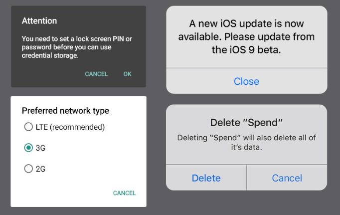
Pop-ups
A popup on iOS is extremely simplified and appears in a rounded corner box with line-separated buttons. On Android, popups use no visual box surrounding them.
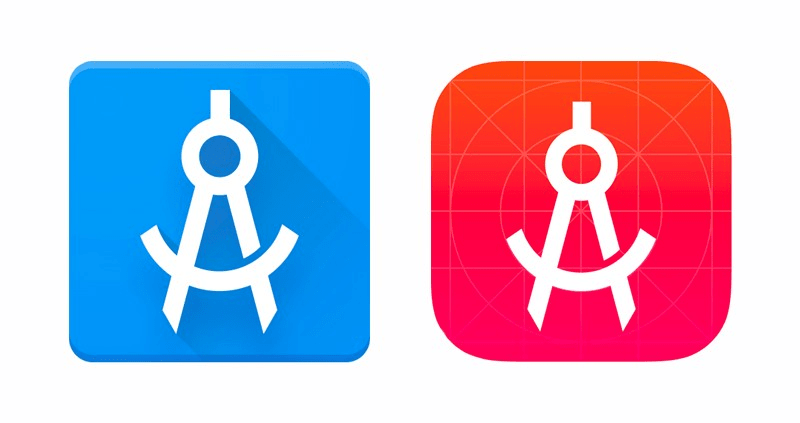
App icon
App Icon is the one that appears on the home screen and is unique for any app. App icon in IOS has to be inside a flat rounded rectangle shape.
Android, on the other hand, gives you more freedom with the shape and style of your app, but still requires a slight shadow.
Action Sheets
Android overlays have a solid color with a slight drop shadow. iOS overlays have no drop shadow but have slight transparency on the background.
_1546535593204.png)
Navigation Menu
On Android, the navigation menu is designed as a sidebar according to material design guidelines.
Whereas, the navigation menu on IOS is designed as a tab bar placed at the bottom based on IOS guidelines.
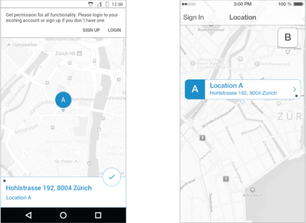
Map
The map is almost the same on android and iOS. the slight difference is that selected pin on Android is displayed on the map but the pin details are displayed at the bottom. Whereas on iOS pin and its details are displayed on the map when clicking on it.
Form
The form is one of the most significant design elements on web and mobile. It differs slightly on Android from iOS. firstly talking about the button, the button on Android is designed as a raised button. Whereas on iOS it’s designed as a plain text link.
The second difference is the hidden menu. In Android, it’s designed as a menu component but on iOS it ’s designed as a table row that opens the picker with a list of items.
Filter
The filter is designed on Android as a menu component based on material design guidelines. On the other hand, the filter is designed on iOS as an action sheet.
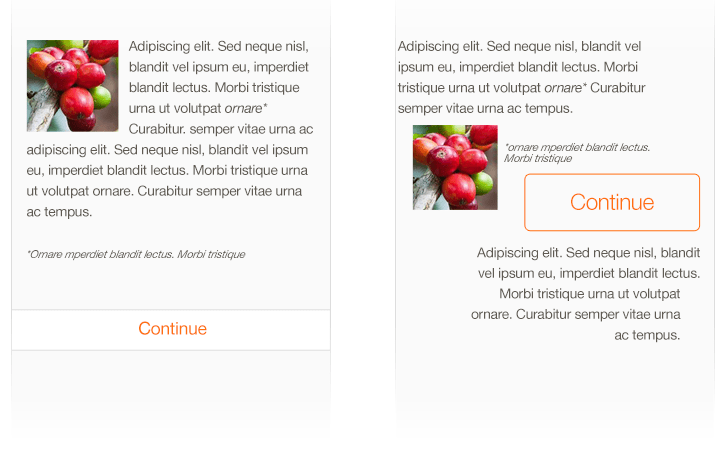
UI Design Do’s and Don’ts
Formatting Content
Create a layout that fits the screen of any device with different OSs. Users should see content seamlessly without zooming or scrolling horizontally.
Touch Controls
Use UI elements that are designed for touch gestures in order not to distract users when clicking on it.
_1546536010916.png)
Buttons
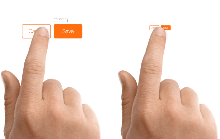
Create controls that measure at least 44x44 points so they can be accurately tapped with a finger.
Text Size
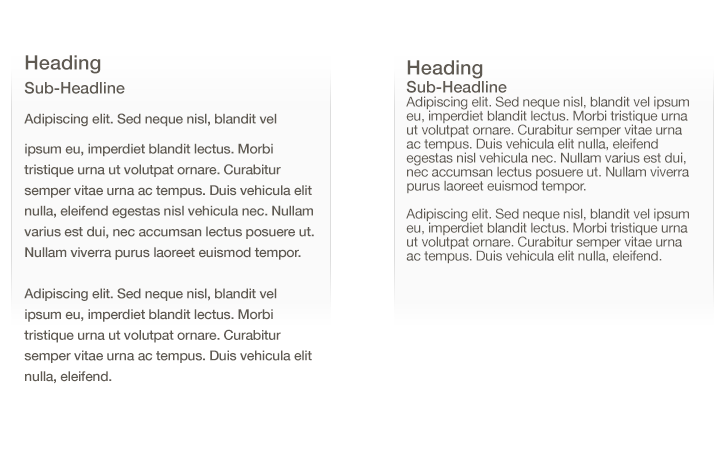
For the minimalism of mobile screens, Text should be at least 11 points to be clear at a typical viewing distance without zooming.
Contrast
Make sure there is a contrast between the font color and the background in order to make text clear.
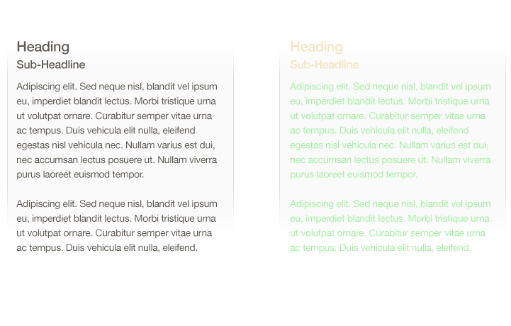
Photo Credit: Developer Apple
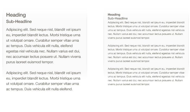
Spacing
Increase line height or spacing for better legibility.
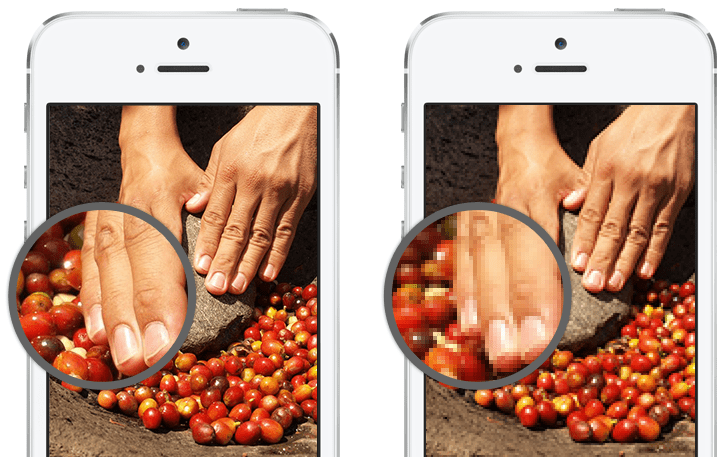
High Resolution
Provide high-resolution images. Images that are not @2x and @3x will appear blurry on the Retina display.
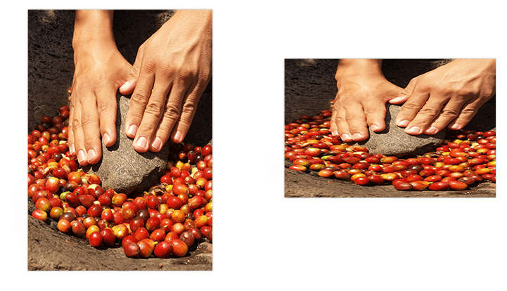
Distortion
Always display images at their intended aspect ratio to avoid distortion.
Alignment
Align text, images, and buttons to show users how information is related.